Alcohol’s penchant for serious craft and a great story has bred brands with fanatical followings. What can other marketers learn and take back to their own categories? David Volker, Senior Creative Director, offers some pointers.
When you look at the spirits category, there’s a lot to envy: tribal levels of loyal follows. An artistic playground for groundbreaking design. Consumers willing to pay premium prices with an insatiable appetite for the new. And a multitude of usage occasions that we seem to partake in, and iterate on, annually. Spirits brands are ones that create cultural conversation, get endorsed by the A-list and tap into our inherent desires with the twist of a cap, pop of a cork or psssssssch of a tab. These are brands with staying power.
In my career, I’ve worked on a multitude of brands in the wine, beer and spirits space, but I’ve also led creative teams for brands in sectors like food, grooming and hygiene. Sure, they don’t carry the inherent exoticism and promise of adventure that a bottle of bourbon does, but they can still create a sense of fandom. Whether it’s a snack cracker or a men’s razor, I’ve worked to bring the same methods to all of these offerings—the creative strategies that take brands from ordinary to obsessed-over. After all, those brands’ marketers want cult status too, right?
The Secret Sauce of Spirits Brands
Find Your Anchor, but Don’t Let it Drown You
No matter the category, it’s important to give consumers enough visual fodder to look like you belong in the aisle and gain their trust. But you also want to serve a dose of new and different to drive trial and, ultimately, selection. One could argue designing alcohol brands is easy. The anchors are so strong in each category, it’s easy to pop up overnight and fit right in. At LPK, we think of anchors as category cues, visual and verbal, that signal familiarity and credibility. For instance: blue and silver = light beer. Serif fonts, batch numbers and craft paper = whiskey. Sleek, sans-serif type, poppy colors and tall bottles = vodka. This makes for a good-looking aisle, but also a sea of sameness.
No matter the category, make use of anchors on pack, in signage and beyond. But, be sure you express what sets you apart, too. When we developed new brands for Beam Suntory, it was an exercise in distinction: Jim Beam Distiller’s Masterpiece capitalized on the rare and bespoke—from its unusual, badge-like bottle shape to silken ribbon and wax seal. Meanwhile, Devil’s Cut, using the last drops extracted from the barrel, told a flavor story unlike anything else in the aisle.
“I’d love to know how many wine, beer and spirits brands boast to be ‘the world’s finest.’ Dig deeper.”
Make a Better RTB
In any category, be wary of redundancy. I’d love to know how many wine, beer and spirits brands boast to be “the world’s finest.” Dig deeper. Find a real, true and differentiating reason to believe (RTB) that leads back to you—and you alone. You’re not getting incremental growth or a new audience’s attention by rehashing the same overused claims to a new generation of consumers.
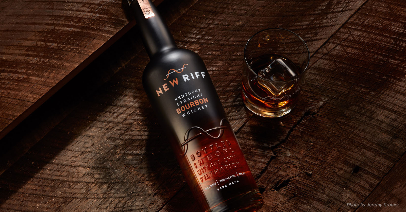
Focus on great storytelling like we did for Booker’s Bourbon, using anecdotes about founder Booker Noe—the guy who coined the term “small batch”—to give the brand heart and soul. Or take New Riff Distilling, a brand we developed around the tension of old and new, heritage and innovation, to activate its positioning: A new riff on an old tradition.

Competition Brings Clarity
One of the most admirable qualities of the spirits category is its confidence in understanding the consumer. These brands know exactly who they’re talking to. More than any other category I’ve worked on, they are laser-focused on who their consumer is and what they stand for. I’ve often thought about why that is. And the best conclusion I can come up with is: choice.
“Even if you’re mass, think niche.”
The liquor store has three-dozen bourbons to choose from, but walk down the razor aisle, and you’ll find two or three. Of course, there is some variation and nuance within each of those three, but it’s a fundamentally different exercise in selection. That can leave a brand trying to be everything to everybody; fighting for the attention of targets as disparate as Peter, 46, a settled father of two, and Tim, 18, uninsured and unsure of what he wants to do next. When you’re one of 30 brands on shelf, you know your role and your audience. When you’re one of three, things can get murky, stale and broad. The competition brings clarity.
My advice? Even if you’re mass, think niche. Get to know your design target like they are a member of your own family. Strive for the kind of consumer clarity and conviction that alcohol brands have. It’s this obsession with the consumer that will compel them to obsess right back.


