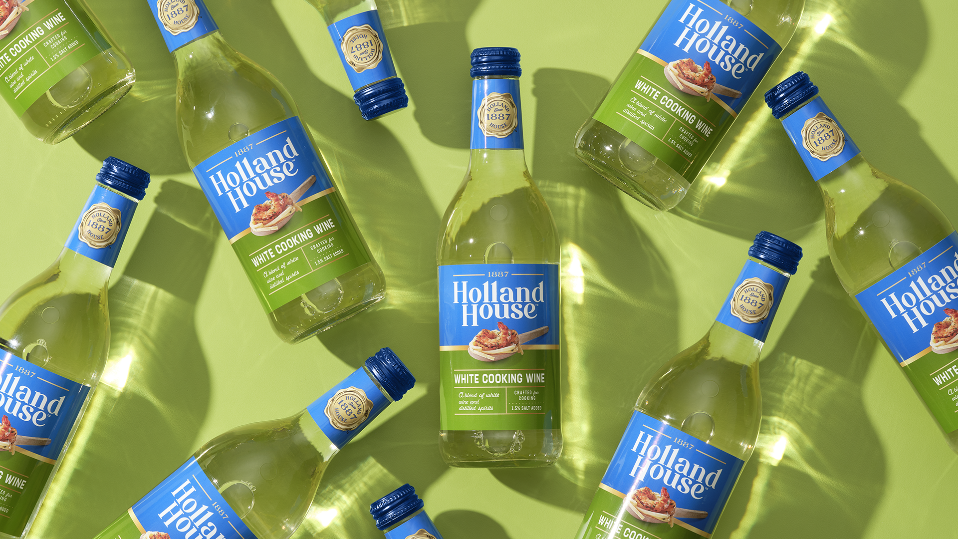
Modernizing a beloved brand.
Services
Holland House
Brand Positioning
Design Strategy
Visual Identity
CHALLENGE
Despite leading the market with a 72% share, Holland House found itself in a curious position—dominant on shelves yet lacking the spark that connects with today’s home chefs.
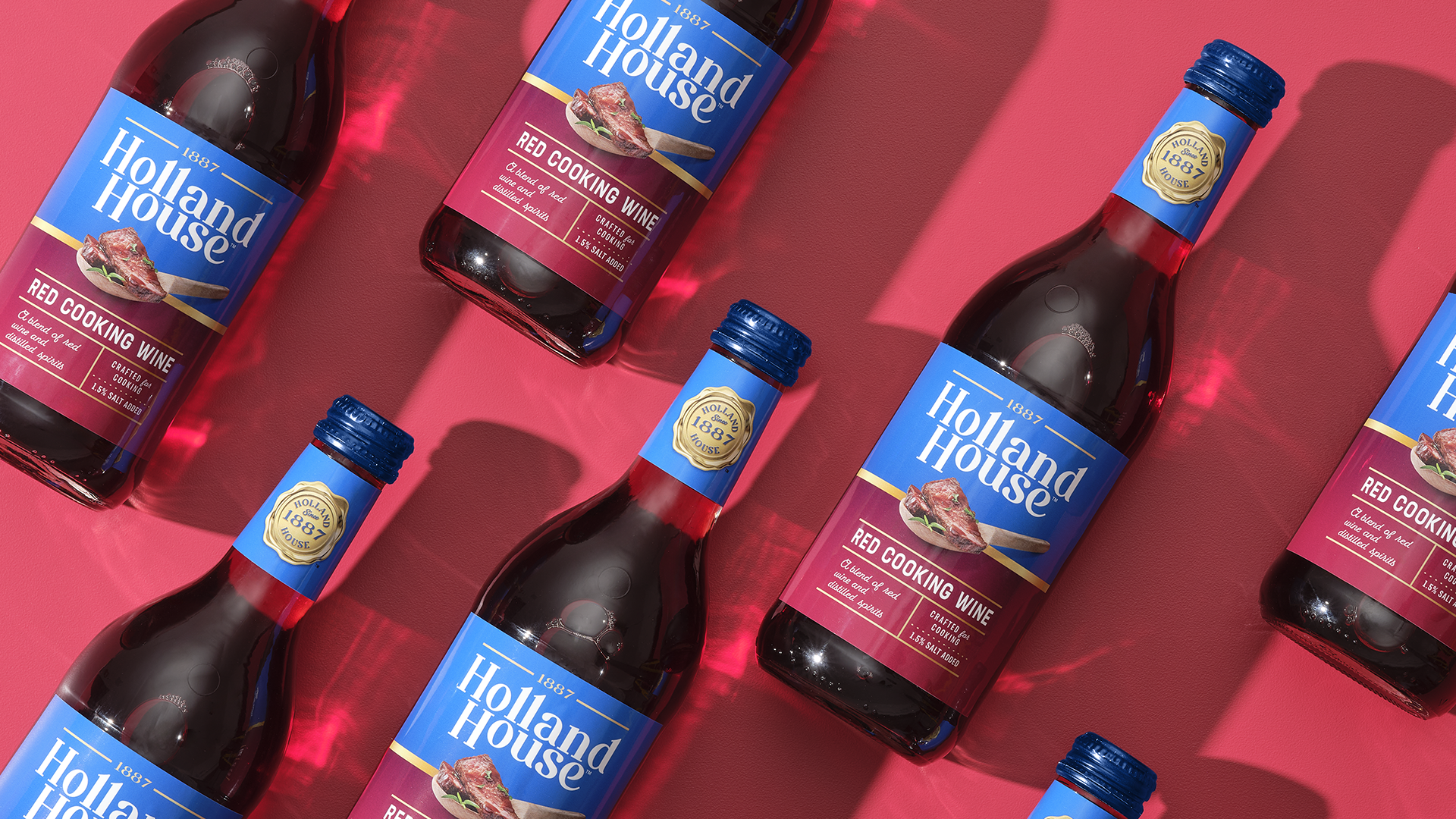
To inspire consumers beyond function and become a brand they’d reach for with intention, Holland House needed a fresh look that honored its roots while capturing modern culinary sophistication.

SOLUTION
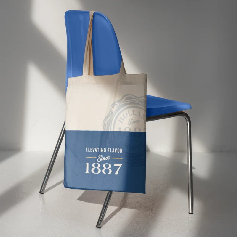
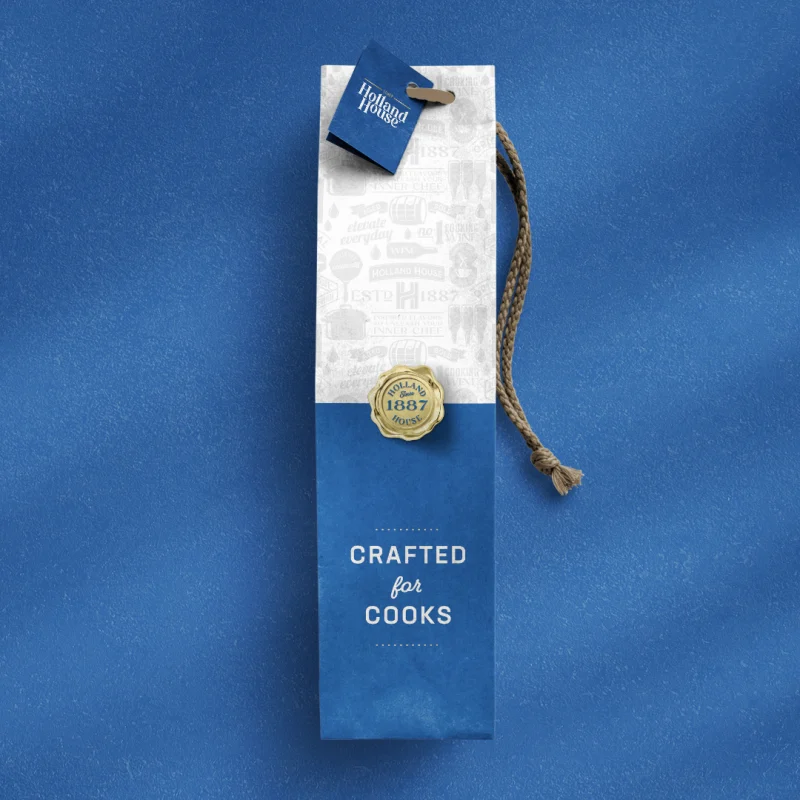
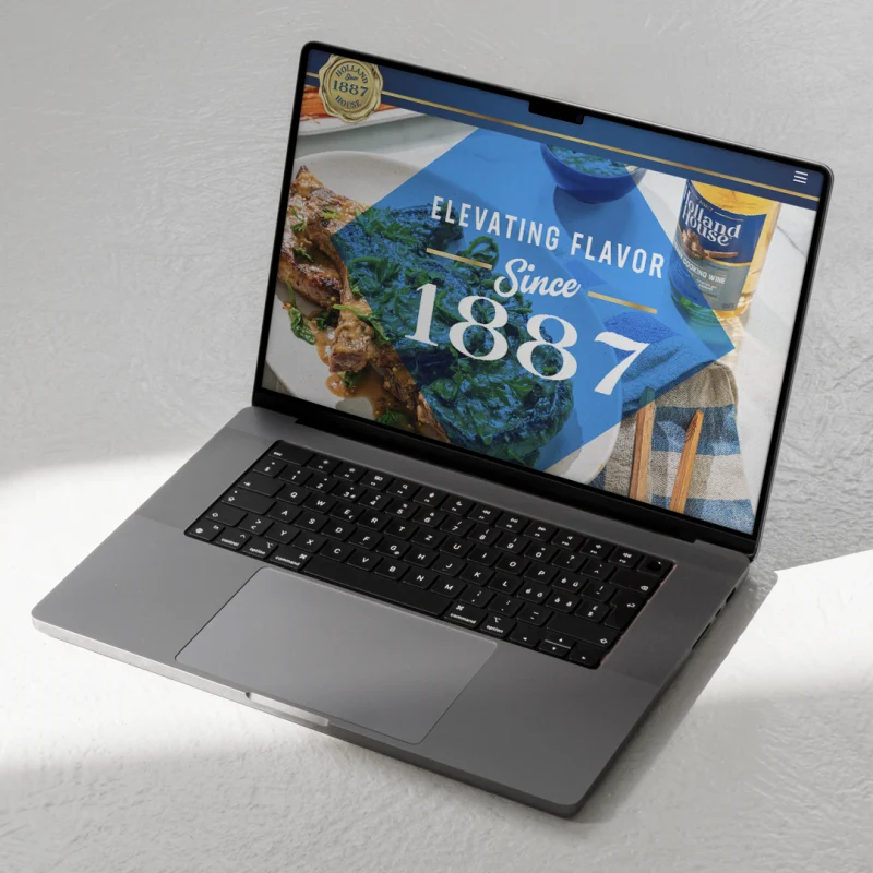
Working closely with Holland House, we set out to redefine what it means to be a kitchen staple. Our approach centered around a new positioning—Simple Sophistication—that combined Holland House’s culinary heritage with a modern, premium appeal.
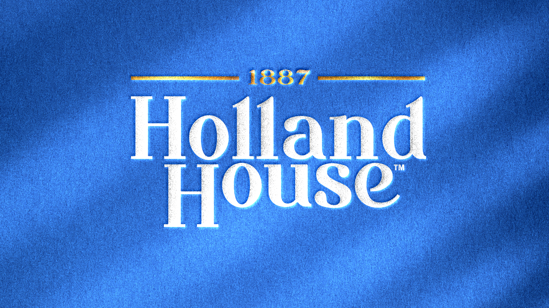
Through a semiotics audit, we explored the subtleties of the category, identifying opportunities to stand apart and create a distinct presence. The result? A cohesive visual identity that turned Holland House into a source of inspiration, with packaging that speaks to quality, creativity and heritage that stands the test of time.

RESULTS
With a bold and unified design system, Holland House now commands the shelf with an unmistakable look that conveys premium quality and culinary purpose. Consumer research showed impressive results: significant boosts in brand perception, shopper engagement, and purchase intent.
Looking forward, Holland House isn’t just a pantry staple—it’s positioned as a must-have for anyone looking to elevate their cooking, bringing a reinvigorated sense of inspiration and delight into their kitchen.
