FROM FRAGMENTATION TO FOCUS
A brand refresh rooted in legacy.
Services
Golden Peanut
Brand Strategy
Brand Identity Design
Communication Strategy
CHALLENGE
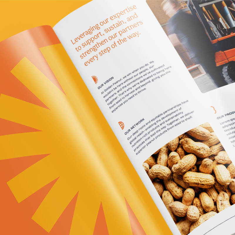
Golden Peanut partnered with LPK to reclaim its roots—evolving from a diversified nut portfolio to a unified, purpose‑driven leader within the peanut industry.
This strategic realignment restored clarity to the brand’s identity, honored its heritage, and positioned Golden Peanut for continued growth and innovation as an integral part of ADM.

SOLUTION
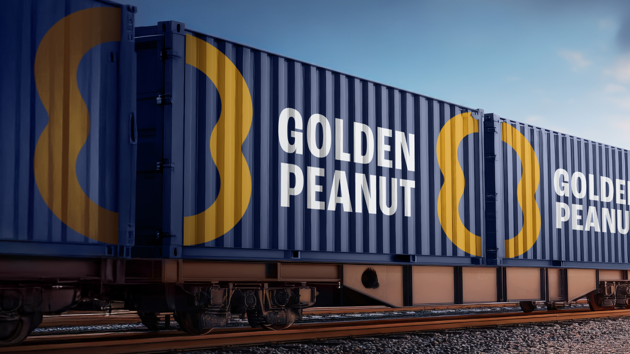
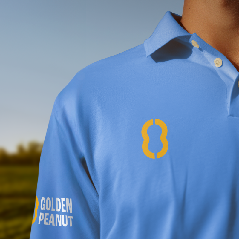
LPK led a full-scale refresh grounded in purpose and precision. The new identity celebrates collaboration between growers and manufacturers, symbolized in a logo that splits cleanly like the halves of a peanut—an intentional nod to history and partnership.
The color palette embodies confidence and vitality: blue conveys trust and calm, while golden orange radiates energy and optimism for the future. Every element was crafted to unify, simplify and refocus the brand on its true strength.


RESULTS
The revitalized Golden Peanut brand reconnects with its purpose as a vital link that unlocks a more innovative, sustainable and nutrition-rich future for the peanut industry.