

Heritage brands often have more cultural value than their visual identity is communicating.
The product may be strong. The story may be credible. The brand may have decades of recognition behind it. But when the branding and packaging no longer communicate that value clearly, consumers may miss what makes the brand worth choosing.
That was the opportunity with Danish Creamery.
As demand grew in the European-style and premium butter space, Danish Creamery partnered with LPK to give its slow-churned, Danish-inspired butter process the attention it deserved. The product already had a strong reason to believe. Our job was to build a brand identity and packaging system that made its quality more visible, distinctive and compelling at shelf.
The business impact was clear. Since evolving its brand strategy and visual identity, Danish Creamery has delivered approximately 33.5% compounded retail dollar growth over two years, according to Circana retail sales data.
The lesson goes beyond butter. When a heritage brand has real product strength, a successful refresh can help the brand show up with the confidence the product deserves.
Start With What Makes the Product Worth Noticing
A strong refresh should not begin with a logo or color palette.
It should begin with the product and the consumer.
For Danish Creamery, consumer insight showed that premium butter was not simply being used as a background ingredient. This was butter to notice, enjoy and savor. The brand had permission to embrace a more indulgent role because its slow-churned process, higher butterfat and Danish-inspired quality could support it.
That led to a clear idea: butter should be tasted, not wasted.
The promise, “Life is worth a little extra,” gave that thinking an emotional frame. Danish Creamery could stand for the small luxuries that make ordinary moments feel more special.
The strategy did not need to dominate the story. It needed to give the design something meaningful to express.
Building a More Distinctive Brand Identity
The identity needed to feel premium without becoming precious.
That distinction matters in food. A premium brand still needs to feel appetizing, approachable and easy to shop. Refinement alone is not enough. The design has to create desire.
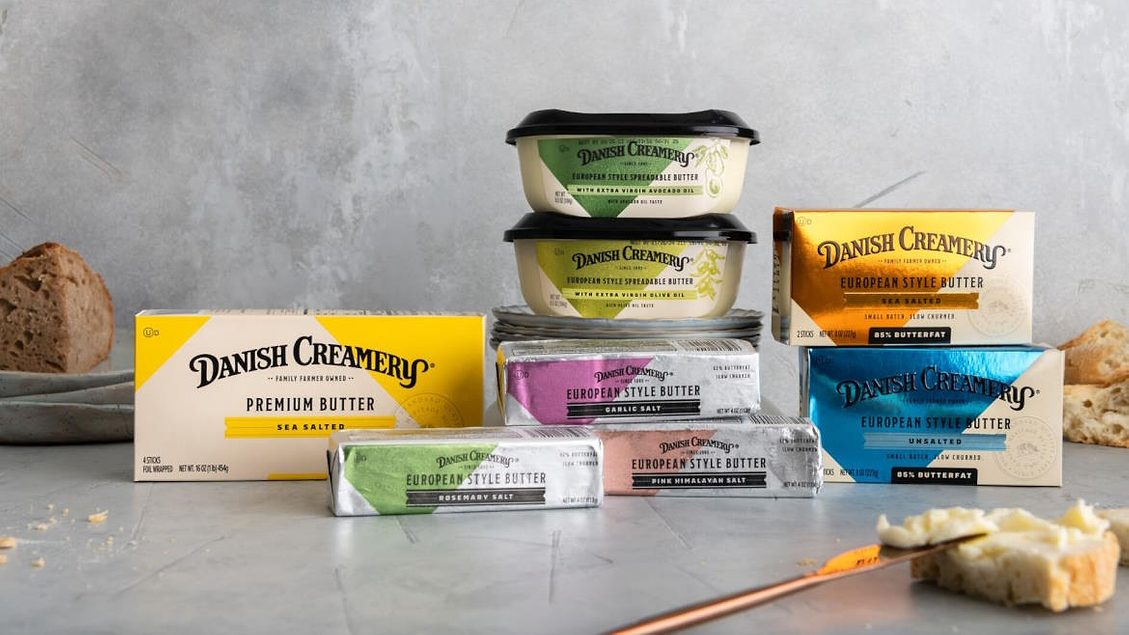
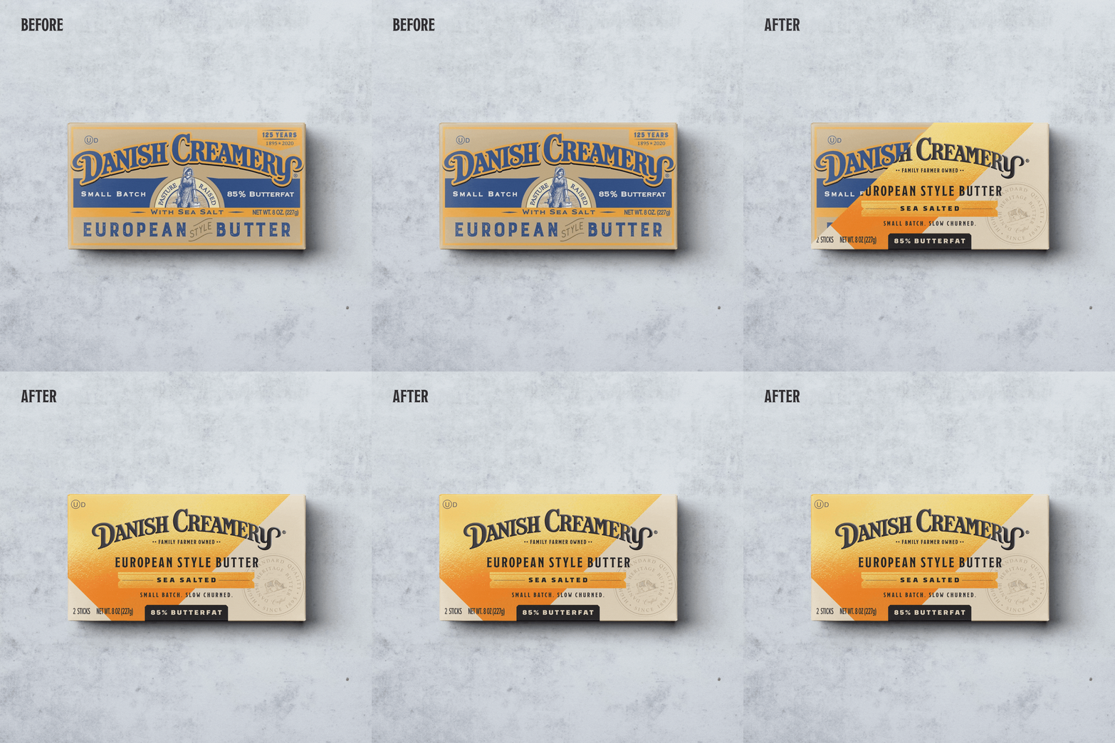
LPK developed a more confident brandmark, a bolder color system and a visual language that balanced heritage with modernity. The curved typography gave the name more character, while the saturated palette helped Danish Creamery stand apart from the quieter visual conventions often associated with premium dairy.
A diamond shape inspired by the brand’s heritage became a recognizable graphic device across packaging and communications. Supporting assets, including a quality seal, flavor bands and three-diamond accents, added structure and reinforced the brand’s attention to detail.
Each element had a role. Together, they created a system with enough personality to be memorable and enough flexibility to support the portfolio.
Packaging That Makes Premium Easy to Understand
Packaging was where the refresh had to prove itself.
Consumers do not experience the strategy in a presentation. They experience it in a few seconds at shelf or in a small ecommerce image.
The Danish Creamery packaging needed to communicate that the product was premium, European style, slow-churned and easy to navigate across variants.
“We put extra time and care into making Danish Creamery butter extra delicious and wanted our new packaging to reflect that premium quality,” said our client, Michael Burdeny, President of Challenge Dairy Products, Inc.
Bold color created distinction between European-style and premium offerings. A consistent hierarchy made the product type, flavor and butterfat easier to understand. The brandmark remained prominent, while the quality seal and graphic square helped organize the portfolio and reinforce craftsmanship.
That balance is critical.
A premium package can be beautiful and still fail if consumers cannot quickly understand what they are buying. A highly functional package can communicate clearly but miss the chance to create desire.
The strongest packaging does both.
Guidelines That Keep the Brand Strong
A refresh is only as effective as the system that carries it forward.
Once the work launches, it moves into the hands of marketers, agencies, retailers and production partners. Without clear brand guidelines, even a strong identity can begin to fragment.
LPK created guidelines for Danish Creamery that established how the brandmark, color palette, typography, graphic assets and packaging architecture should be used. They also defined the brand’s tone as passionate, purposeful, evocative and unapologetically indulgent.
Good guidelines do more than protect consistency. They help teams understand how to extend the brand without losing the idea at its center.
When Brand Expression Supports Business Growth
Danish Creamery already had the product quality, craftsmanship and heritage. The refresh gave those strengths a more distinctive expression and helped consumers better understand why this butter deserved a place in the premium tier.
Since evolving its brand strategy and visual identity, Danish Creamery has delivered approximately 33.5% compounded retail dollar growth over two years, according to Circana retail sales data.
Of course, brand growth is never the result of design alone. Product, distribution, pricing, marketing and category momentum all contribute. But the performance reinforces the business value of aligning a strong product with a clear premium story and a packaging system built to communicate it.
“This is proof that design is a business tool, not a creative exercise. When strategy and design align, they clarify value, strengthen premium positioning and drive growth. The Danish Creamery transformation is proof that investing in brand experience can deliver meaningful commercial impact. I appreciate the partnership with LPK in bringing this to life.”—Michael Burdeny, President of Challenge Dairy Products, Inc.
The work did not turn Danish Creamery into something it was not. It gave the brand a presence that matched the care, indulgence and quality inside the box.
The product had the credentials. The refresh helped turn them into a stronger reason to choose.
ABOUT LPK