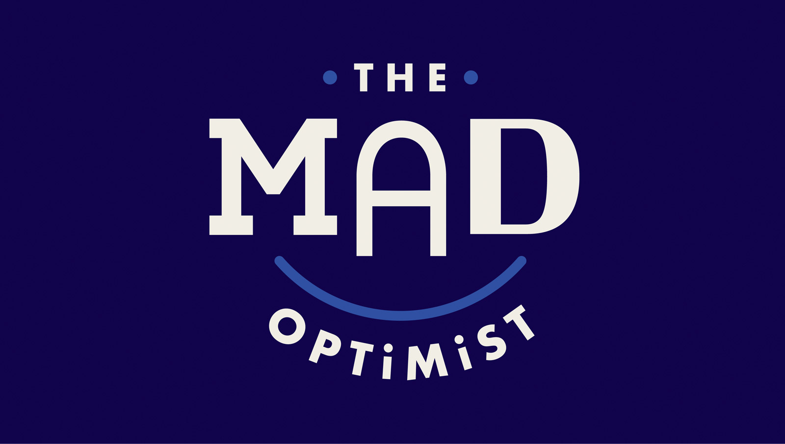
 Our visual identity for bodycare brand The Mad Optimist took home Silver, while our rebrands for TrūRoots® and Greater Cincinnati Foundation received honorable mentions.
 “The name and visual identity for The Mad Optimist derive from the brand’s promise, crazy for good, and is crafted to resonate on multiple levels,” explains LPK Creative Director Jen Dusold. “It hints to a bit of naivety and endless optimism. But it also nods to the lab, where the real magic happens. With the brand’s customization offerings, every consumer gets to be a mad scientist—or optimist. The brand’s visual identity really celebrates that.”

 More of LPK’s rebranding work earned high marks at the event. Our strategic rebrand for Greater Cincinnati Foundation received an honorable mention, as did our bold revamp for TrūRoots, a range of quick-serve ancient grains from The J.M. Smucker Company, up for Best Brand Evolution of the year.